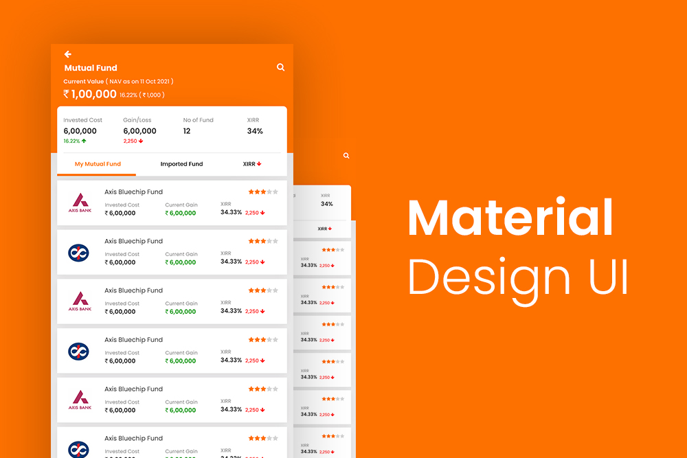
Material design is a design language developed by Google. It was released in 2014 and is regarded as one of the most comprehensive and flexible set of guidelines for designing digital interfaces.
Material design attempts to answer these questions:
- What does the future of the web look like?
- How can we make a website that is beautiful, fast, and provides a good experience for everyone, regardless of who they are or what they’re using?
- How can we create a system in which developers can more easily build sites, apps, and other interactive experiences?
- What new technologies should be embraced on the platform?
- How do we help provide an experience that people want to use again and again?
- How do we push ourselves to innovate when making?
What is material design?
Material design is a popular Google design language that was first introduced in 2014. The goal of the material design is to use principles of physics and natural materials to create digital products that are more understandable, intuitive, and attractive.
This design language provides a set of guidelines for UI and UX designers, enabling them to create richer and more responsive digital experiences for their users. Material design is a specification for a unified system of visual, motion, and interaction design that adapts across different types of devices.
How does material design differ from other design styles?
Before Material Design, there were other design languages that were popular but they all had their own flaws. For example, some designers rely too much on skeuomorphism which makes the app look more like its physical counterpart. Others might have relied on gradients or shadows just because the trend was popular at the time.
Material Design focuses on simplicity and agility while still maintaining beauty, responsiveness and craftsmanship.
Material design is a user-interface style in which the interface is responsive, attractive, and consistent. It takes into account the different ways that people use their devices, such as when they are in portrait or landscape mode. The guidelines in material design were created by Google and are now open source to be used by any company. Material design incorporates motion, lighting effects, and depth so that the interface feels real.
What are the benefits of material design?
Material Design is more than just a visual language. It includes animations, motion, and tactile feedback that give users a natural interface to explore your content. It also gives Android developers more control over their app’s UI and UX through the use of new development tools
- For starters, it is highly scalable and consistent across all devices, which means it saves time developing apps for different device sizes (e.g., phones vs tablets)
- Material design also focuses on speed of information processing with its clean layout and intuitive gestures
- it provides better usability because of its ability to adapt to different contexts
- it simplifies the process of creating apps by removing needless complexity
- App icons have been given more room for their labels on home-screens
- Interface controls have been moved from the bottom of the screen to the top
What are the drawbacks of material design?
The main intention behind the design language was to develop a single standard for digital design across multiple platforms and device types. This intention has delivered mixed results because it has not always delivered an intuitive experience for users who are using it for the first time.
A lot of people think that the material design guidelines are not well followed in Android applications, which is true to some extent because people don’t use them correctly and often go with what they feel comfortable with. This results in inconsistency between different apps which can be frustrating for users who want consistency throughout their device experience
What are some examples of websites that use material design?
Google is the most well-known company that uses Material Design with its products like Google Chrome, Gmail, YouTube etc. Other popular websites that use Material Design are Airbnb and Facebook, Netflix.
How can a website’s material design be improved?
Designers and web developers can learn from the mistakes and successes of other websites. Rather than reinventing the wheel, they can use design patterns and UI components that have already been proven to work.
A website’s material design can be improved by ensuring that all interactive elements are visible even when they are overlapped by other elements or move around to different positions on the screen. The website should also be responsive so that it displays well irrespective of the device used to access it.
What are the most important aspects of a site’s material design?
The following are the most important aspects of a site’s material design: –
- responsive web design
- natural user interfaces
- simplicity
- clarity
Clear call to action buttons or links that don’t require a user to scroll down or click through multiple pages for a purchase or sign up
Designing a website is not easy. It requires knowledge of different aspects of web design, for example, usability, accessibility, and design. Designers must take into account these aspects in order to create a site that is both visually pleasing and functional.
There are many different aspects of the site’s material design which are important in their own way. One aspect of the website’s material design is how it looks on each device (mobile or desktop). Another aspect of the website’s material design is how it responds to the user’s input (e.g., scrolling or navigating).
A site can be designed to work on any device; however, there are some features that won’t work on smaller screens (e.g., pop-ups) because they will take up too much space.
Does a site need to have a specific color palette, font, and font size to be considered “good” material design?
There is no consensus among designers and clients as to what constitutes a good design. There are many different opinions on this topic. Some say that a site needs to have a specific color palette, font, and font size to be considered “good” design. Other designers think that it’s the content that matters, not the superficial details such as fonts and colors.
It would be wise for web designers to follow the branding guidelines provided by their clients because they know best what their consumers want.


