What is animation in UX?
UX is the experience that a user has when interacting with a website or app. It has been used in many industries like marketing, branding, and technology. Animations are one of the ways that UX designers use to improve users’ experience.
Animation can be used as a way to convey information, which makes it easier for viewers to understand what’s going on without being too distracting or boring. It can also be used as a way to highlight something important within the software by using progressive revealing (the animation progresses from one state to another).
Animations are often used in interfaces such as scrollers, progress bars, and buttons to make them look snappy and appealing. It can also be used to describe user flows, navigation, design, and more.
Screen Loading – Basic vs skeleton loading animation
There are two types of loading animation in UX design: basic and skeleton. Both have their own benefits and can be used depending on the size of the website.
Skeleton loading animation is a more modern design choice that makes it easier for users to quickly tap on the screen and load whatever they are looking for. It’s also a more efficient loading time since it only uses one type of animation, where as basic loading animation is made up of at least three different animations that include spinning, linear, or swirls. In simple way it means:
Basic loading: A simple, standard animations that will play as your website is being loaded.
Skeleton loading: This type of animation will play when your page loads (notice the page gets transparent) and then it’s up to you what happens. You can choose to have something happen on the screen (a click for example), or have it fade away entirely when it is finished.
Transitions
Transition animations are one of the most powerful tools in the UX toolbox. They allow users to change their location or context without leaving your site.
Transitions can be used to convey a feeling of movement, change, or anything else that is happening on the screen. For example, if you are designing a website and it is time for a new page to load, you might use a new loading animation that is different from the previous page loading animation in order to signal that this new page will be different than what they have seen before.
Transitions are also used in landing pages and emails to signal important moments such as sign-ins or email notifications.
Relationship between elements in UX
There is a strong correlation between the elements in UX design. For example, if there is a need for clean and smooth interactions, designers would put more focus on the graphical elements of the design.
Some people might believe that it takes time to create an e-commerce website. However, these people are wrong because they cannot grasp the relationship between different parts of UX design.
The relationship between elements in a user interface (UI) can be defined as the following:
– An element can be a type of container, or group of containers or elements.
– A container is a component that holds other components, usually at its center.
– An element has an appearance, position and/or function.
Relating to this topic, we should consider the following:
– Elements are parts of a UI that serve different purposes and have different functionalities
– They can also be classified into groups based on shape, size or color.
Why use feedback system to improve UX?
The importance of feedback systems in UX design is undeniable. They enhance the design process by improving the quality of UX, making it more realistic, and enabling change early on.
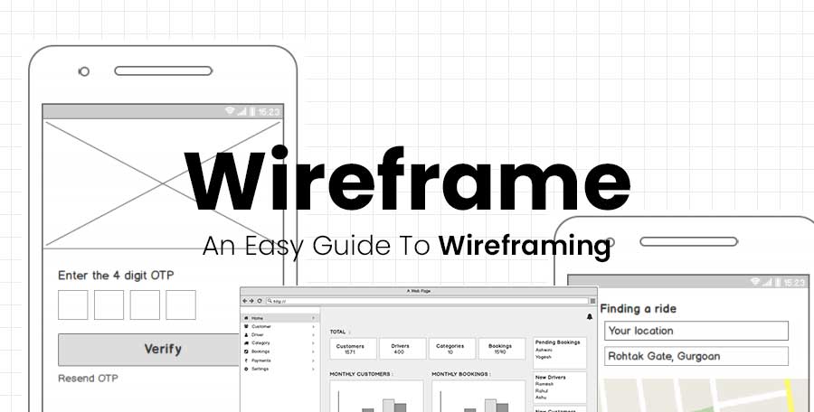
Feedback systems help designers understand what users think about their design. Feedback can be provided in a range feedback channels like: interviews, usability tests and wireframes. On top of giving immediate feedback, these channels also provide data that can be used to create future designs.
The most important part of any feedback system is how it is collected and managed by the team. This can be done through different methods like using surveys or using a dashboard for specific projects or tasks.
Tools for improving animated effects and motion in UX?
Animated effects Motion in user interfaces is often a way to enhance the experience of mobile and web apps. There are many tools used to create motion in UX.
Motion effects can be used to create an immersive experience, enhance the visual appeal and make the UI more engaging. However, it’s important to use them effectively – otherwise users will get frustrated with them.
There are different ways that designers can use for creating motion in UX:
- Use animation library (free or paid)
- Use CSS animations
- Make a custom native app with animations/motions
- Get help from software engineering experts
Tools for improving animated effects and motion in UX have already been created by many companies. They are mainly focused on making the process of creating animations more efficient, like Facetune which uses machine learning to make photorealistic animations look lifelike.
Animate project is a storyboard tool which makes it easier for product teams and animators to work together on ideas before they get into production, saving time. There is also Proximity which creates immersive experiences with 3D objects interacting in real-time through touch, sound or movement cues.
Storytelling Method
Storytelling is all around us, it’s a way of communicating meaning and getting to the heart of the user. UX designers have been using storytelling as a way of understanding their users.
Storytelling has evolved and UX designers are using different techniques to convey their message and engage with the user in a more meaningful way.
As data collection becomes easier, so does storytelling. Data-driven narratives allow us to see human behavior with data points that we have collected – which creates an even stronger story than before.
The growing popularity of data-driven narratives can be attributed to its ability to convey complex thoughts and emotions in a quick manner without losing its power over time or being too actionable


