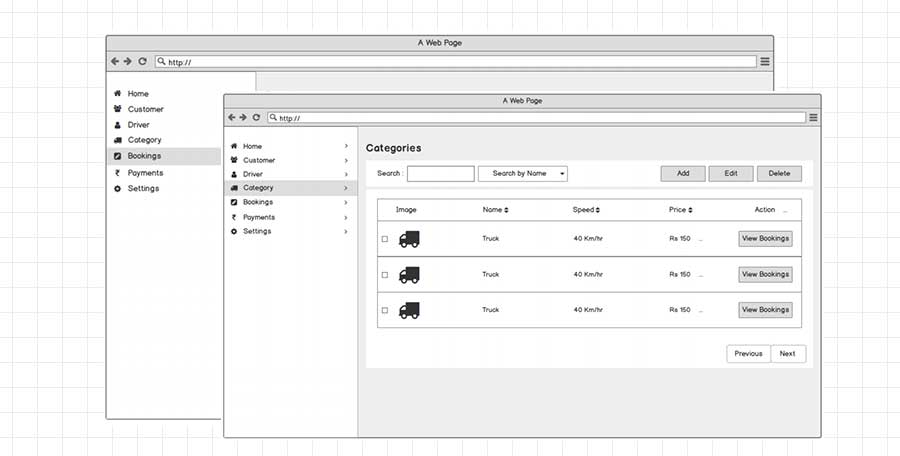
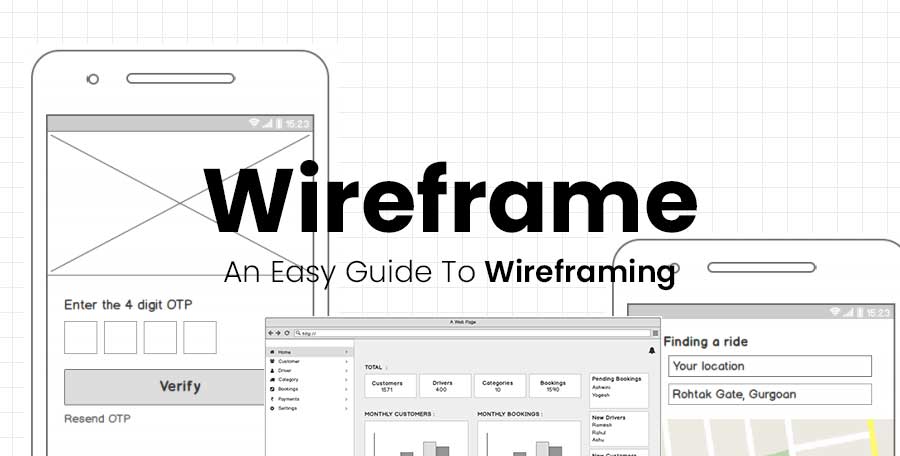
The logical structure to begin with a rough wireframe to start any design process is framing user experience foundation, user interface and visual design. This basic structure is significant to start the design from scratch, however complex enough to act as a strong base moving ahead.
Undoubtedly, wireframes act as the backbone and create the entire layout of your project, making it simple to create individual parts. UX designers have a different mindset about wireframing, some treat it as a vital part, and some call it a waste of time.
However, with the growing technology, designers have lots of tools enabling them to create low-fidelity prototypes quickly, add interactivity within seconds; wireframes are no longer a final destination.
So what is wireframing?
A wireframe is a layout of a digital interface that shows the impact of interface elements on the page. The wireframe is utilized to frame out the functionality and content of the page, which takes into account user journeys and user needs.
Basically, in start-ups and agile enterprises where there is iterative and collaborate nature of design and development is more crucial. They play a vital role in project layout, information structure and sticking everyone on the same page.
Often the motto of using wireframes varies with the needs of clients and developers. It is mostly like delivering the information we need to demonstrate to others, whether we prototype it or sketch it for others to understand the product better.
Types of wireframes
A wireframe is often a low-fidelity paper sketch of a page design with lines and boxes illustrating visual elements. Modern technologies enable designers and developers to build wireframes of a varied fidelity level without high efforts and less time.
Typically, there are three widely known wireframes are as follows:
Low-fidelity wireframes
They are black and white illustrations concentrated on the lion’s share of the page. UI elements are shown as lines and boxes without detailed annotations. Such types of wireframes are quite abstract; however, they offer you to check the basic structure of the UI (User Interface).

Medium-fidelity wireframes
Such types of wireframes developed in a monochrome palette, generally grey-scale, which makes it similar to the previous one. This type can be made via digital tools or manually so that the UI components are more realistic and detailed.
Placeholders are equipped with comments and images detailing their destination. Copy elements like headers, headlines are distinctive and enable to make a typographic hierarchy.
High-fidelity wireframes (mockups)
This type created using digital tools. The basic difference between high-fidelity and the other two types is that high-fidelity is created in colours and demonstrate the screens in the view to finalize visual performance.
The visual elements are built with shadows and textures. The fonts are styled. Designers focus more on alignments and sizes of UI components. It is like the static version of the website or app demonstrated screen-by-screen or page-by-page.
Why wireframing?
Keep the design and layouts user-focused
Wireframes are very efficient and used as one of the best communication systems as they instigate conversations with the stakeholders and developers, facilitate feedback and reviews from the users, and develop ideas between the designers.
Conducting user testing at every stage is crucial as it enables the designers to identify keyholes and harbour honest feedback that assists in developing the product layout.
Wireframing is a perfect method for web and app designers to gauge user interface. By utilizing a pseudo-Latin and Loren Ipsum text as a placeholder to upcoming content, developers and designers can leave users with the questions like “what is your expectation of content for the dummy placeholder content?”
All these insights help the designers know the best intuitive and eye-catching design for the users and develop products that are easy to use and comfortable.
Define and clarify website features
While discussing your ideas with the clients, they may not be technically skilled to develop the call to action time. Wireframing relied on features that will demonstrate to the clients about the functioning and purpose they’ll serve.
Wireframing also enables stakeholders to measure the required space to integrate all essential features, clarify the page’s functional features and connect the site’s information to its actual visual design.
Looking at the features on a wireframe will also enable you to show how the functional features work collectively and may even remove non-working elements from all of the pages. Maybe wireframing can be trouble for stakeholders.
Wireframes are budget-friendly and quick to create
So what is best about wireframes? They are budget-friendly and quick to create. Indeed, you can frame a wireframe just by using a pen and paper to hand. The access of available tools tends to create a digital wireframe without spending a penny and within minutes.
When your product seems good and well polished, the user might likely be honest about its first impressions. However, by revealing the basic layout of the page, pain points and flaws can be easily analyzed and rectified without any hassle and expenditure.
How to make your wireframing efficient
There are not big tactics to create quality wireframe. We will help you know how to make a productive and efficient wireframe from the bottom to top line:
Do proper research
Not even wireframing, you should do a thorough research while wireframing to process your goals, reach the audience and resolve the UI issues.
Keep it simple
The main motto of wireframing is to make a layout of pages, the move later on.
Use a monochromatic palette
User experience always matters, and you should focus on it during the design process. It makes your product more productive and helps you take it to the next step of success.
Write annotation
If you are considering showcasing the wireframe to the team, it would be beneficial to use annotations. These annotations enable us to analyze and understand the ideas deeper and quicker.
Collect reviews
Team collaboration is always essential. You must take reviews and opinions of designers and other team members. Never forget to take feedback from the users if possible before the launch as well. It enables you to save time and improves productivity to create a more sophisticated design.
Use a grid
What is about users’ perception? The solution is a grid. Use a grid to place all essential complements efficiently.
Final words
Are you ready to create your wireframe but don’t know how and where to begin? This guide will help you craft a lucrative design and frame a page layout that can attract users. Just make your ideas visual and collaborate with an efficient team to make the project successful.


